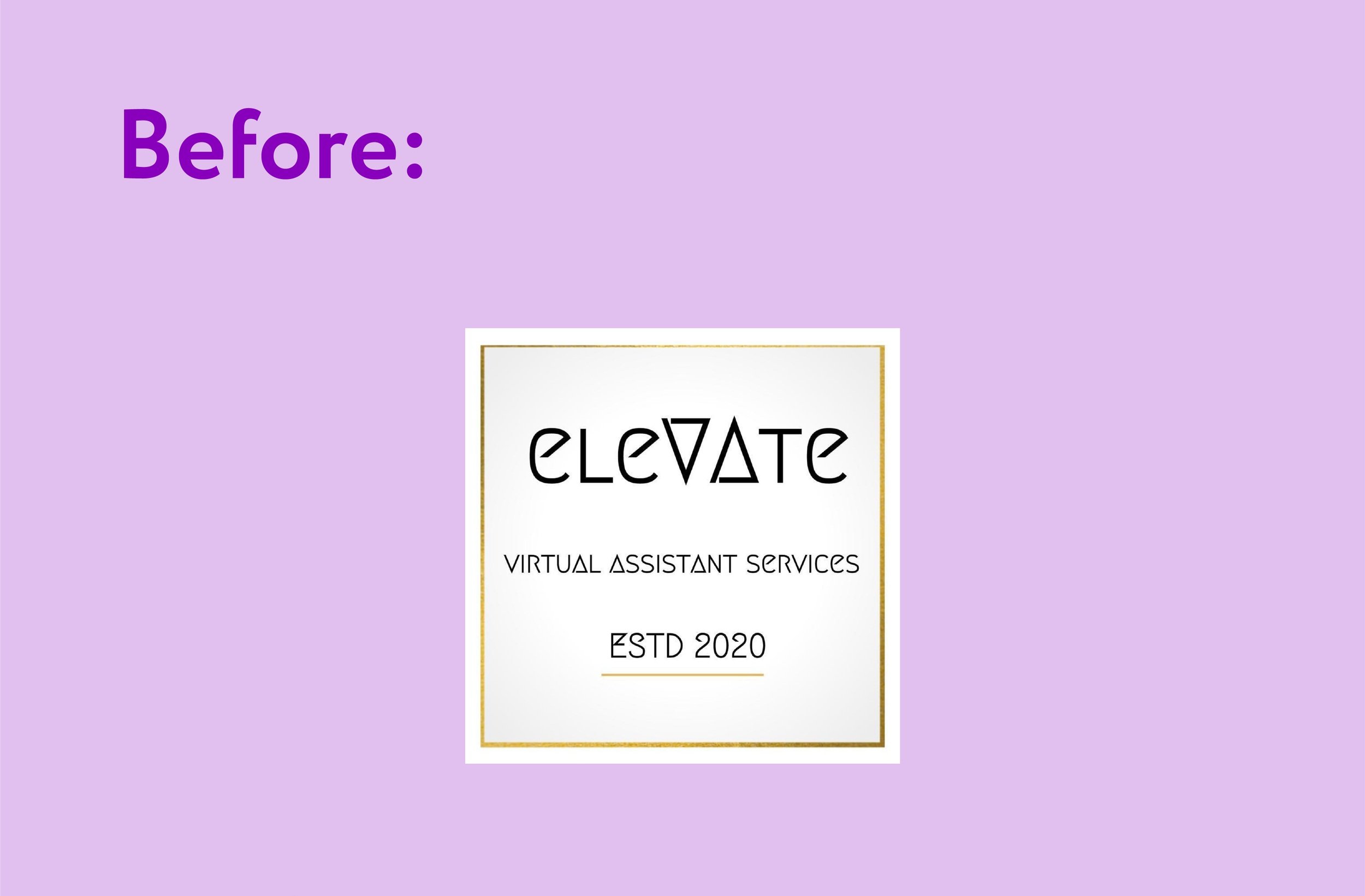
Case study: a logo refresh for eleVAte Virtual Assistant Services
When Tina from eleVAte Virtual Assistant Services got in touch with us earlier this year, she was feeling ready for a logo refresh. Her business was 2 (nearly 3) years old and she was using her DIY logo from when she launched her business in 2020 🚀
She was ready for a change that reflected where her business was now (bigger, more established, and delivering a high-quality service to clients) and she wanted a stronger visual identity to stand out.
We started with a consultation to learn about her, the passion behind her business, and her target clients. From there, we presented her with a few concepts and she chose one to move forward with.
Before we started working together, how did you feel about your old logo?
“Satisfied but I knew it needed an update”
Where and when did you get your old logo?
“I designed it in an app when I started my business”
Tina had four goals she wanted her logo refresh to achieve:
✅ To strengthen her brand identity
✅ To update to a more modern look
✅ To stand out from other businesses
✅ To mark a change in her business (e.g. growth)
After presenting Tina with a few options, and making some final tweaks to her chosen design, her new logo was complete:
Her chosen design has a lot of meaning:
⭐️ V and A slot into each other, showing a ‘perfect fit’
🎀⏳ The icon is like a bow (neatly tied up processes for clients) and like a sand timer (saving client’s time, making the most use of time)
⬆️ ‘A’ is literally eleVAted and pointing upwards
⬜ Geometric, in keeping with previous branding
👀 Easy to read from afar
🌟 Emphasis on ‘VA’
How do you feel about your new logo?
“I love it”
And your new colour palette?
“I love it”
Has your new logo met your goals?
”Yes, all of them!”
Along with her final logo files, we presented Tina with a PDF showcasing her brand fonts and colours, including a page that demonstrates which of her brand colours contrast well against each other so she can make her content more accessible.
Tina says,
“I’d been thinking about doing a logo refresh for a while, and after chatting to Amy I knew immediately she was the right person to do it! Amy’s a real pleasure to work with and is clearly passionate about design.
From our first meeting, Amy guided me step by step through the process, and listened very carefully to the brief and what I was trying to achieve with my new logo.
She kept me fully up to date throughout and gave me all the time I needed to consider the options at different stages of the process.
The end result completely ticked the boxes and it delivered even more than I’d hoped for! I feel like my new logo design now completely reflects my business and the stage I’m at with it.
If you‘re thinking of refreshing your own logo, or have any other design needs, you must get in touch with Bloom Creative!”
You can connect with Tina on LinkedIn, Instagram, and her website.
Would you like your logo to get a refresh? Contact us or book in a free discovery call and let’s chat about what we can do for (and with!) you.
Bloom Creative is a design business based in Kent who support local and national businesses with a range of services that enhance their brand and get them seen and remembered, including: quality digital content, eye-catching print design, and bespoke branding & brand refreshes.
If you’re interested in our services and/or getting to know us better, you can book in a virtual coffee break call with founder Amy Walters.


